M35 was briefed to design a new visual identity that positions MCA Australia as the reference point for contemporary art in Australia and beyond, from which an extensive collaborative process was undertaken to re-imagine the visual identity from the ground up.

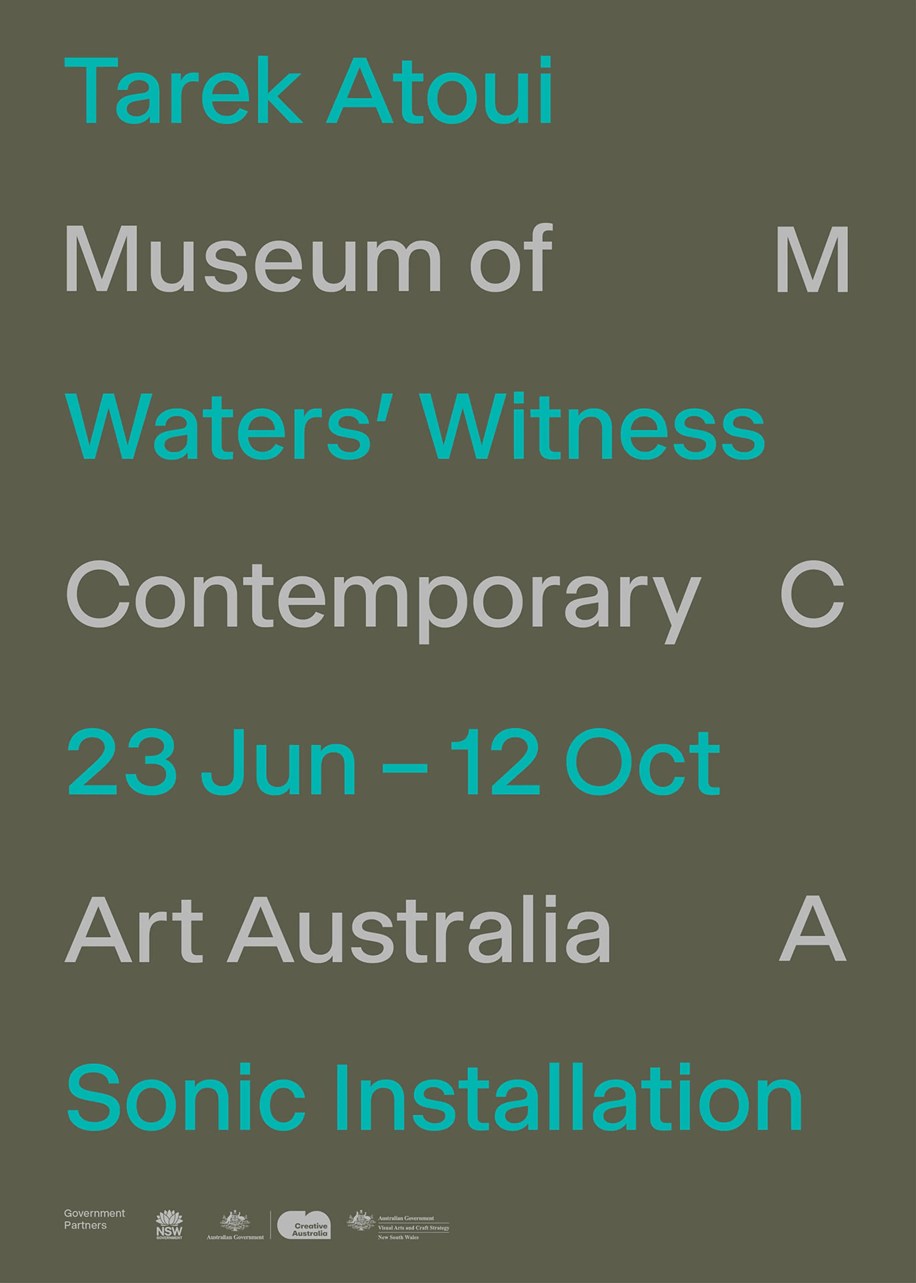
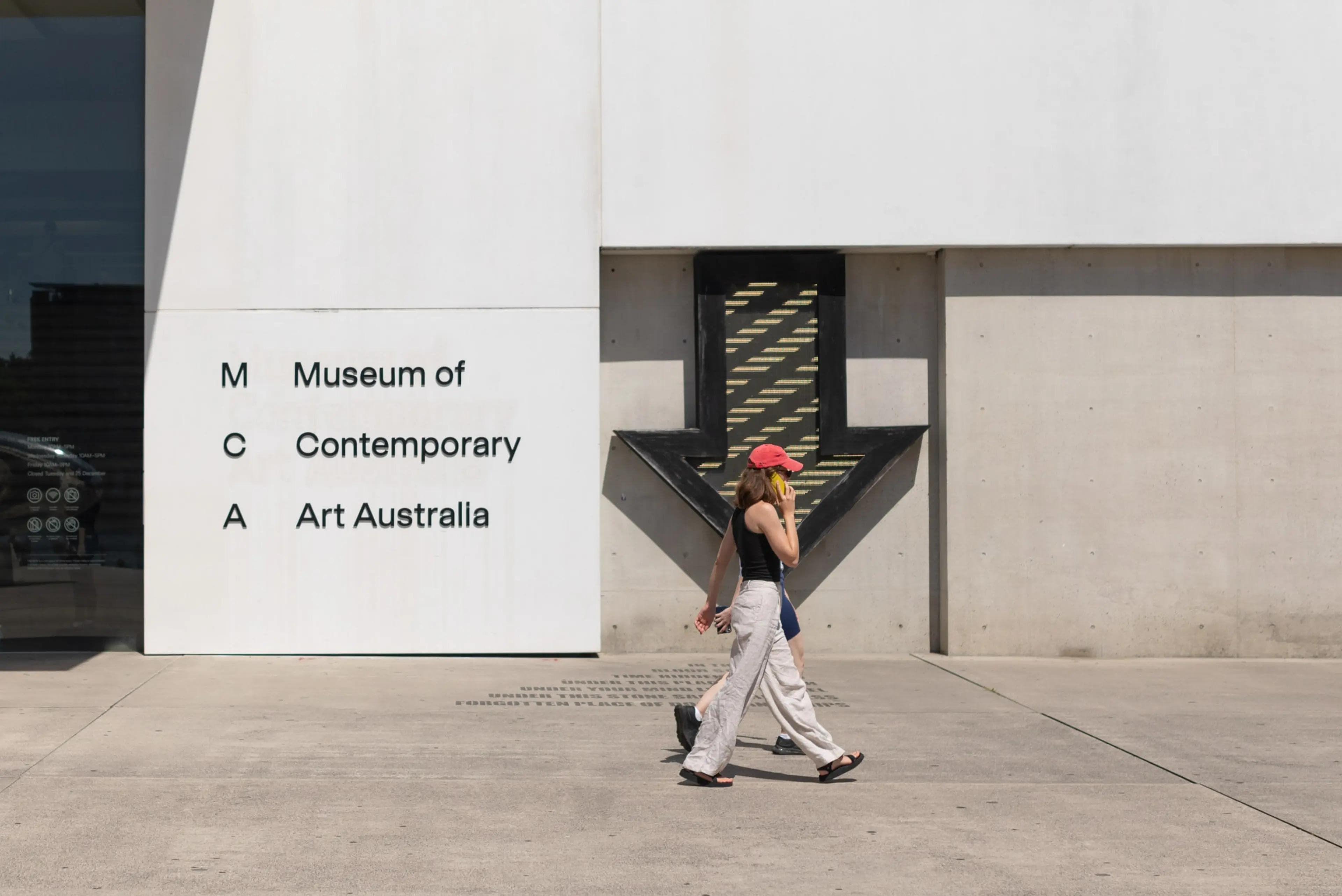
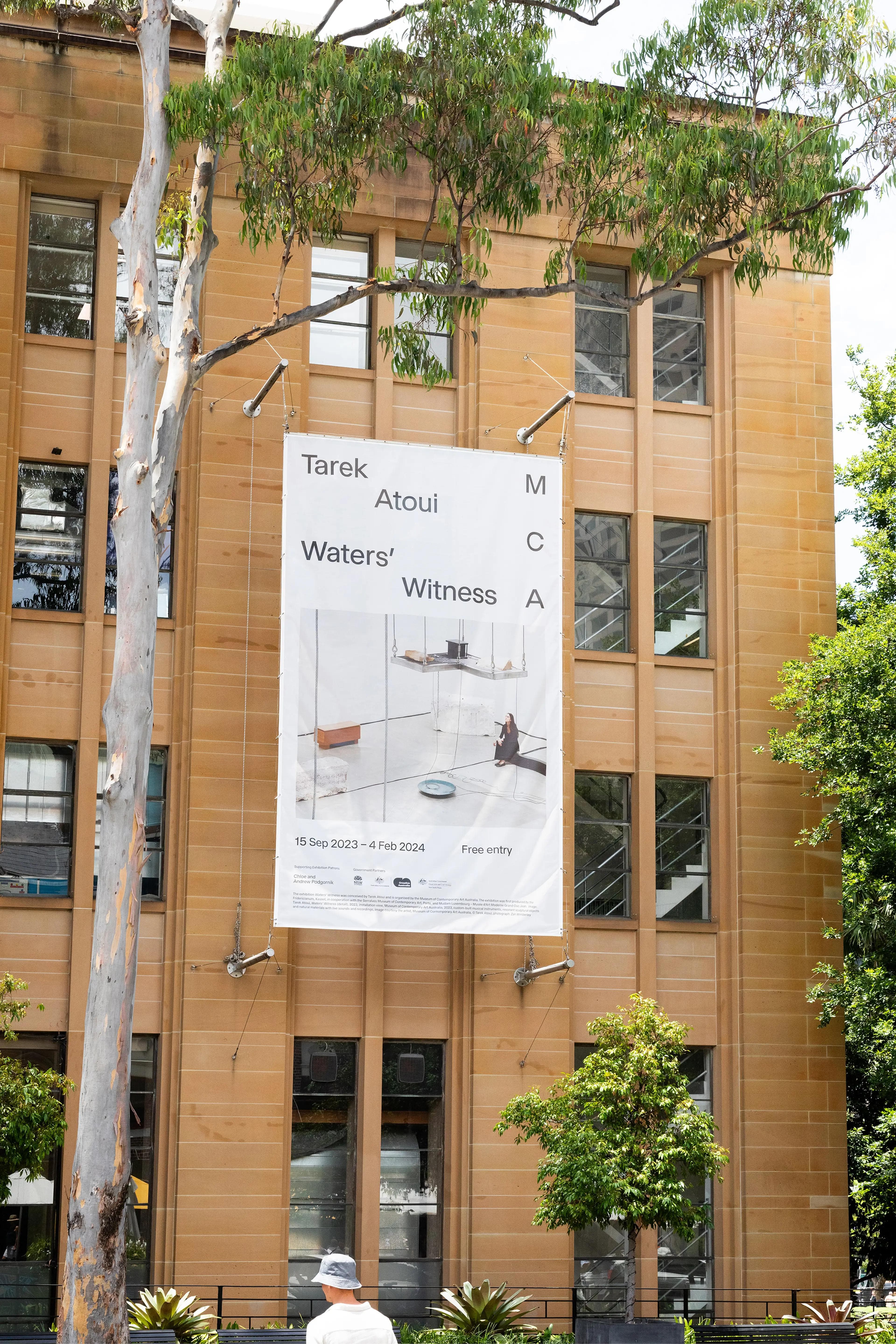
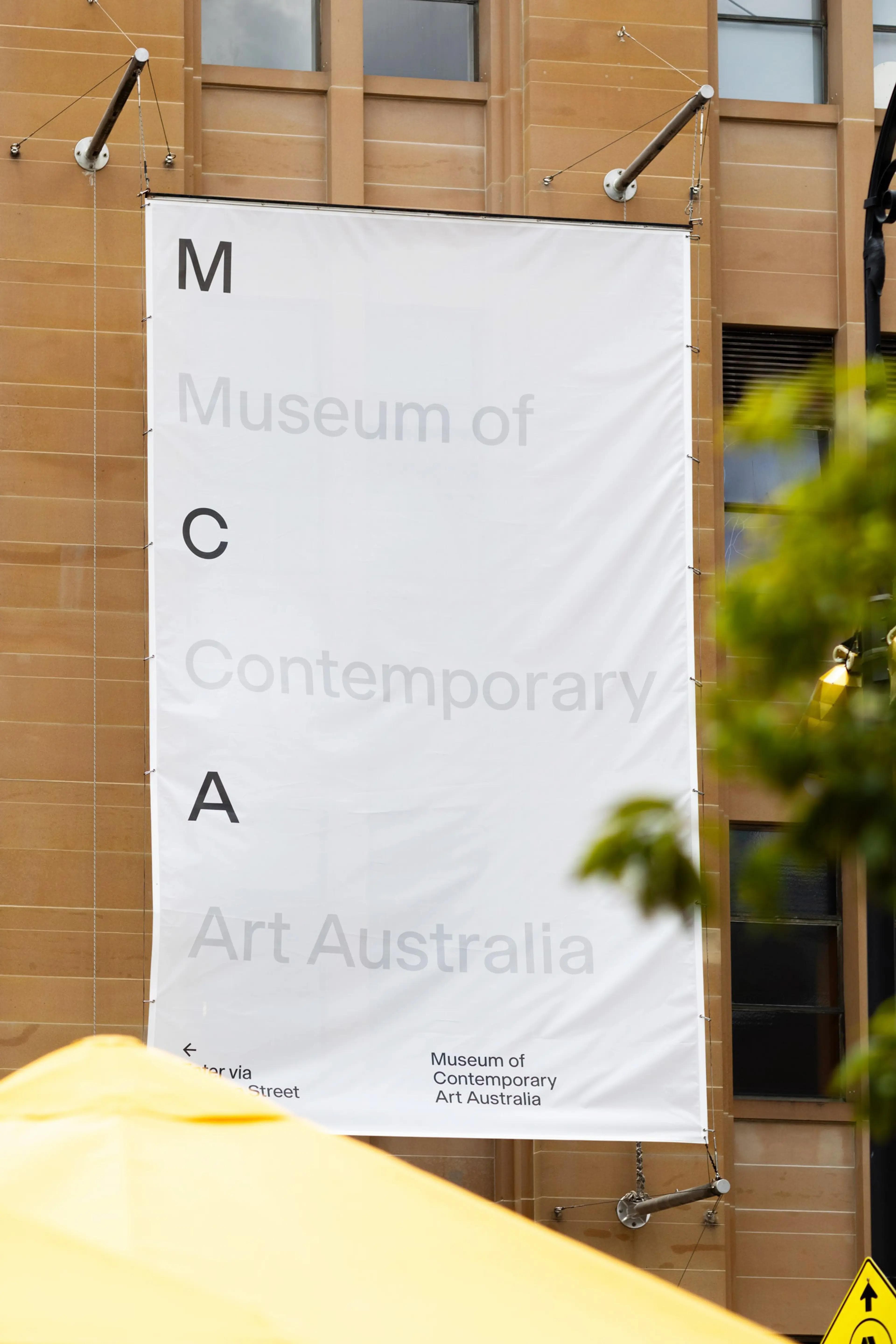
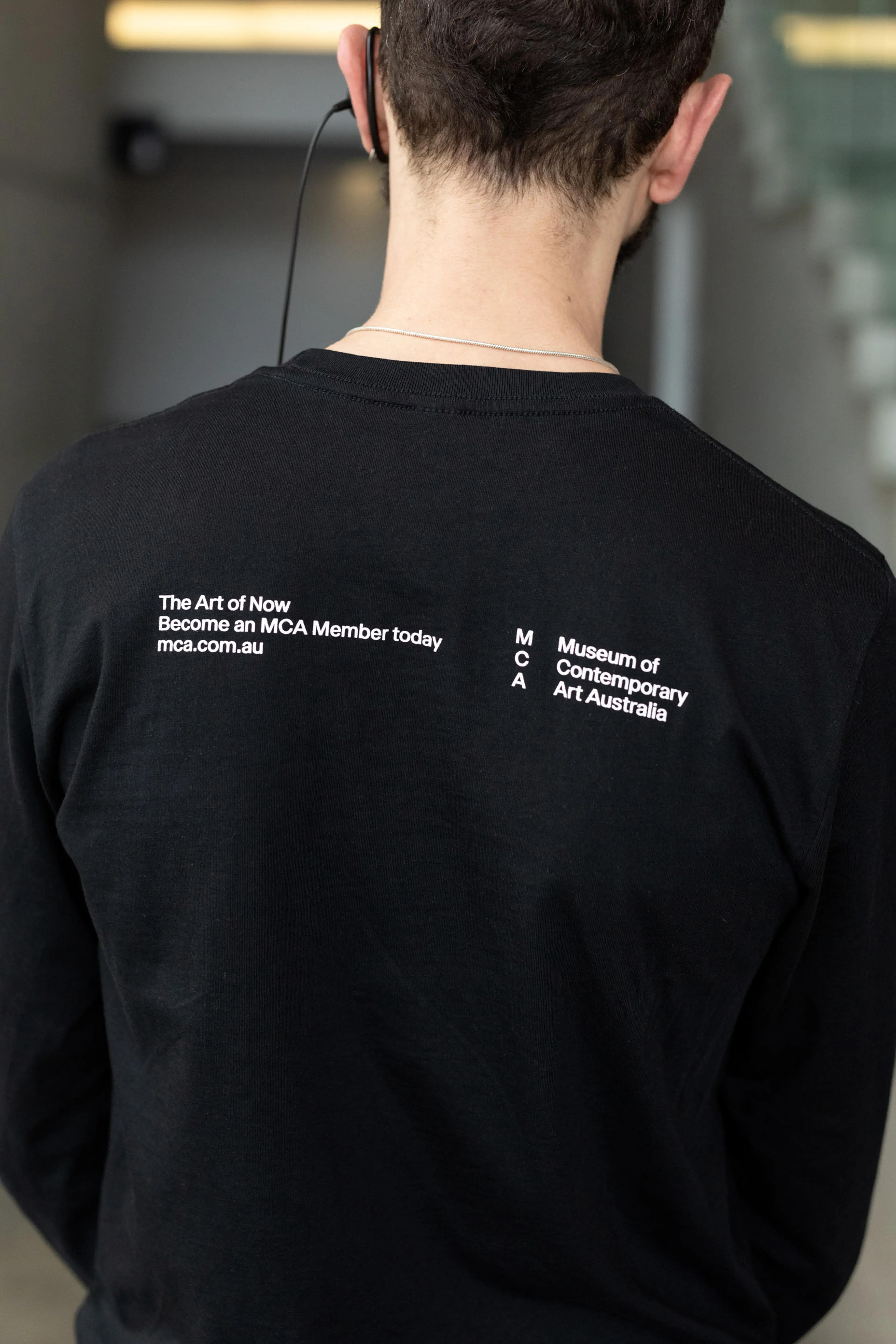
The brand mark draws inspiration from the geological strata of the site in which MCA operates, and the layers of rock that signify different periods in time. This approach communicates what is considered contemporary today will form a layer in the historical accumulation of past contemporarie, visaualised in the mark through the vertical stacking of the acronym.
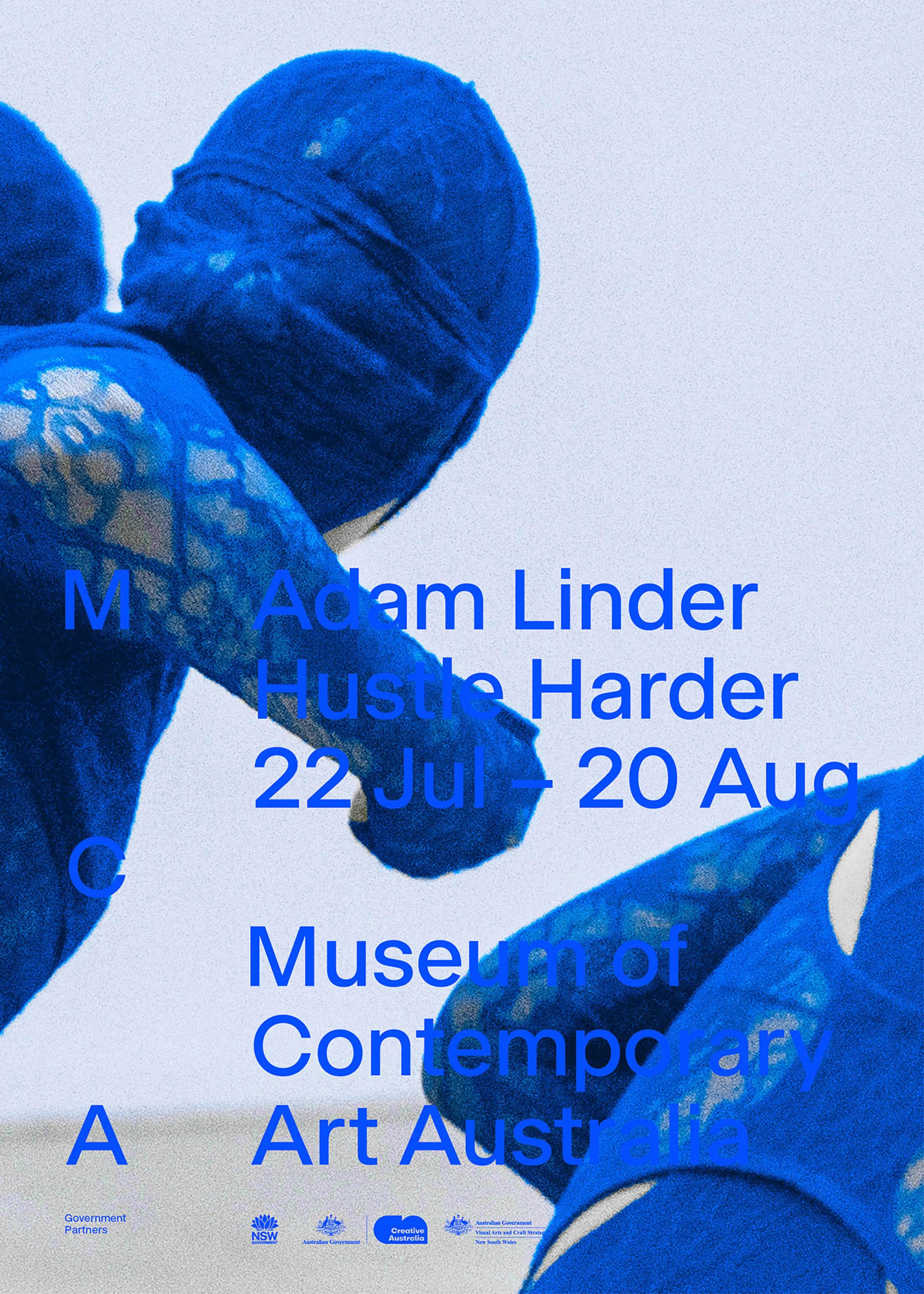
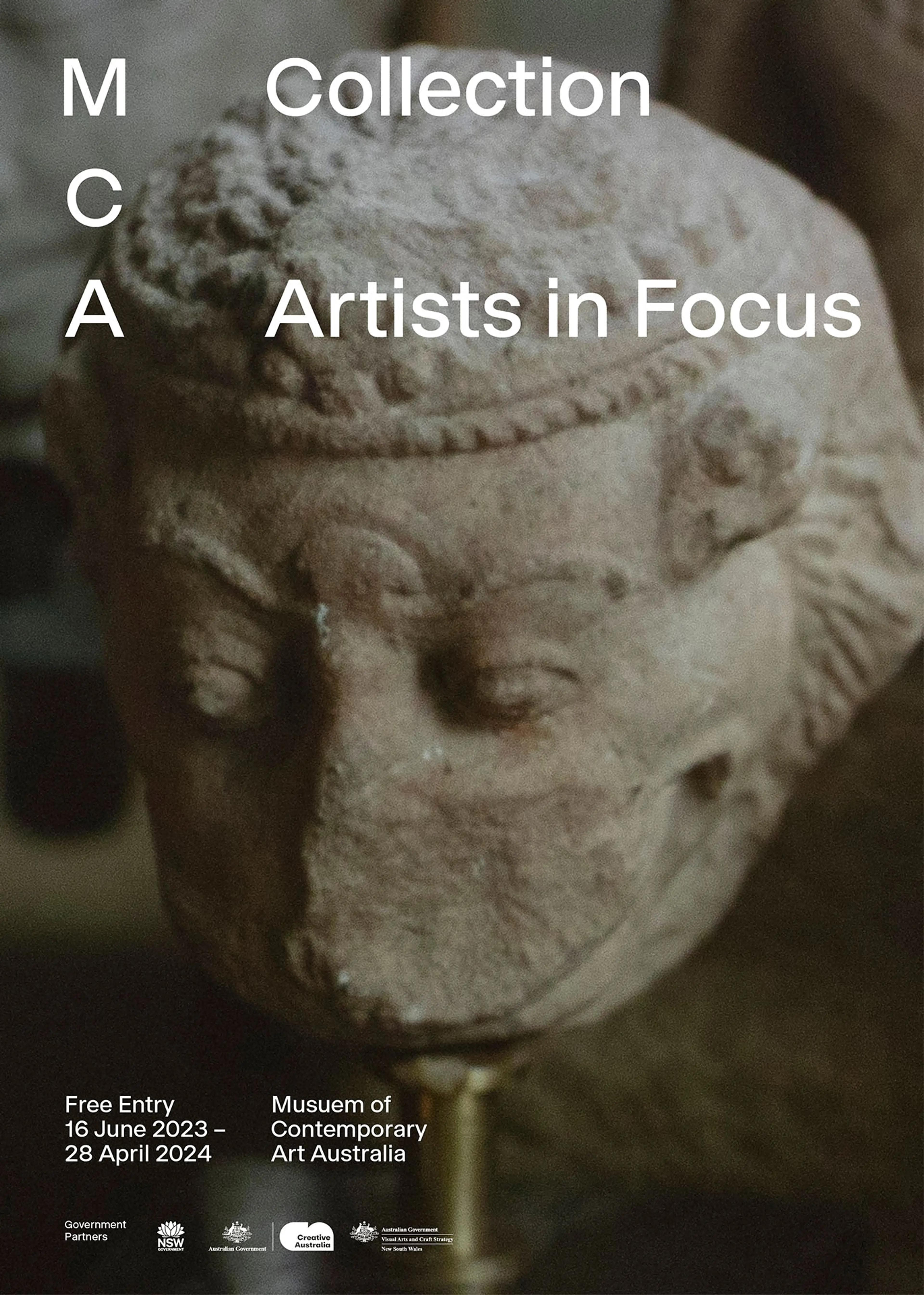
Form-wise this results in the dominant visual points of both the ‘M’ and ‘A’ directing the eye towards the ‘C’, making ‘contemporary’ the focal point of the logo. The strata layers also inform the wider design system guiding how typography and imagery are used. The system was designed to build recognition through consistent use of brand elements, while allowing the flexibility to adapt and change to complement the multitude of formats and artworks it is utilised with.
Project: M35
Design partners: MCA in-house team
Website partners: MCA in-house team, Pollen and Boojum
Photography and video: Courtesy Museum of Contemporary Art Australia
Location Photography: Tomas Friml
Location Video: Harry Kemp